
Introduction
What comes to your mind when you see the red, white, and blue swirl of the Pepsi logo? Maybe the refreshing taste of your favorite soft drink? Or memories of Super Bowl commercials? Whatever it is, there’s no denying that the Pepsi logo is one of the most recognized brand symbols in the world. But have you ever wondered how this famous emblem came to be—or what it actually means?
From a modest beginning as “Brad’s Drink” in 1893 to becoming a global soft drink powerhouse, Pepsi has constantly reinvented itself. And right at the heart of that evolution has been its iconic logo. Whether subtle or radical, every logo redesign Pepsi undertook mirrored shifts in culture, design, and technology.
In this comprehensive guide, we’ll explore the Pepsi logo meaning, symbolism, and its complete evolution through all the years—from 1893 to the futuristic rebrand in 2024. We’ll decode its design elements, reveal some hidden messages, and even share fun facts you might not know.
Pepsi Logo
At first glance, the Pepsi logo might seem simple—a circular swirl in patriotic colors paired with clean typography. But behind that simplicity lies over a century of branding strategy, design innovation, and cultural relevance. The logo has come to symbolize not just a beverage but an attitude: youthful, bold, and forward-thinking.
As a visual identity, it represents more than a fizzy drink—it reflects Pepsi’s place in pop culture, advertising history, and the competitive world of soft drinks. It has undergone more than 20 significant redesigns, each one reflecting the tastes and trends of its era.
Meaning and History
Pepsi Logo Meaning
So, what does the Pepsi logo actually mean?
At its core, the modern Pepsi logo—with its red, white, and blue globe—conveys movement, energy, and balance. These colors aren’t just patriotic nods to its American roots; they also symbolize:
- Red: Excitement, energy, passion
- White: Clarity, simplicity, honesty
- Blue: Trust, freshness, reliability
The circular “globe” is stylized to look like a smile in recent versions, reinforcing friendliness and approachability. The logo shape and balance also subtly suggest yin-yang harmony and dynamic motion—perfect for a brand that’s constantly adapting.
Pepsi has used its logo to signify a brand that is both timeless and trend-setting, always in motion but grounded in its heritage.
Evolution
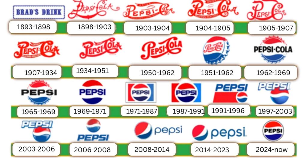
Let’s walk through the complete evolution of the Pepsi logo, year by year.
History Bradshaw (1893–1898)
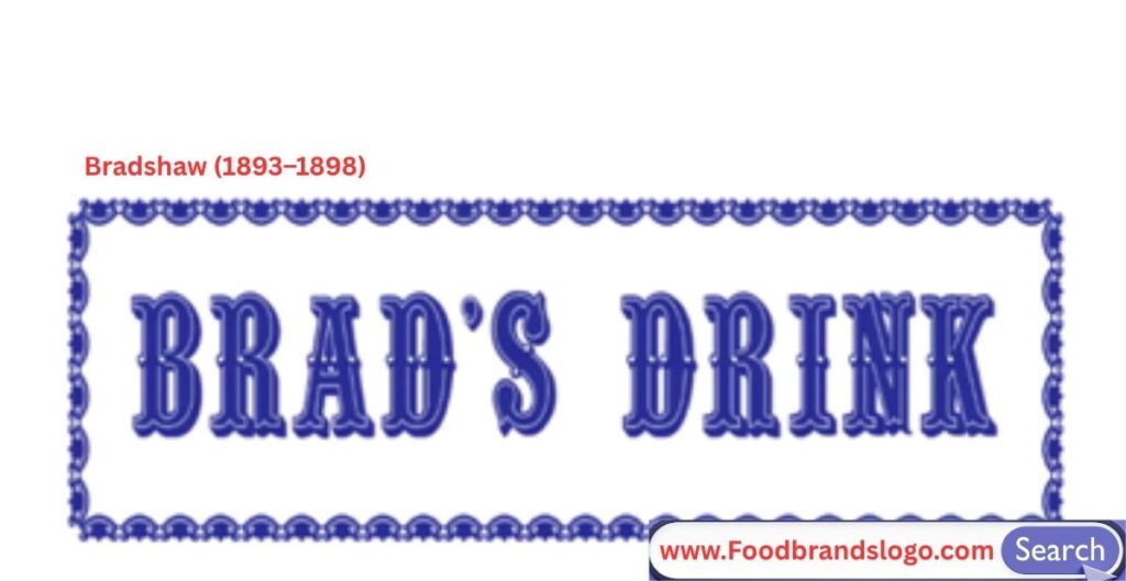
The story of the Pepsi logo begins long before it became the globally recognized swirl we see today. Back in 1893, a young North Carolina pharmacist named Caleb Bradham developed a new soft drink in the back of his drugstore. Originally formulated as a digestive aid and energy booster, the beverage was a fizzy mix of sugar, water, caramel, lemon oil, nutmeg, and other natural additives. Bradham called it “Brad’s Drink.”
At this early stage, there wasn’t yet a formal Pepsi logo as we know it today. Instead, Brad’s Drink was served at soda fountains with handwritten signage or basic block lettering—very much in line with the medicinal branding of that era. The branding was functional, not fashionable, and designed more to inform than to attract. Still, it was this modest beginning that laid the foundation for what would become one of the most iconic brand identities in the world.
In 1898, Bradham made a pivotal decision that would change everything: he rebranded his beverage as “Pepsi-Cola.” The new name was inspired by two key ideas—“pepsin,” an enzyme thought to aid digestion, and “cola” from the cola nut used in the recipe. With the name change came the earliest version of the Pepsi logo—a simple, decorative script that mimicked the popular typefaces of the time, similar in style to what Coca-Cola had already made famous.
Though basic by modern standards, this first Pepsi logo helped establish the product as more than just a pharmacy soda. It gave the brand a distinct identity, and it marked the beginning of Pepsi’s long and colorful journey through branding history. Even at this nascent stage, Pepsi understood the power of visual representation, something that would remain central to its identity for the next 130 years.
1898–1903
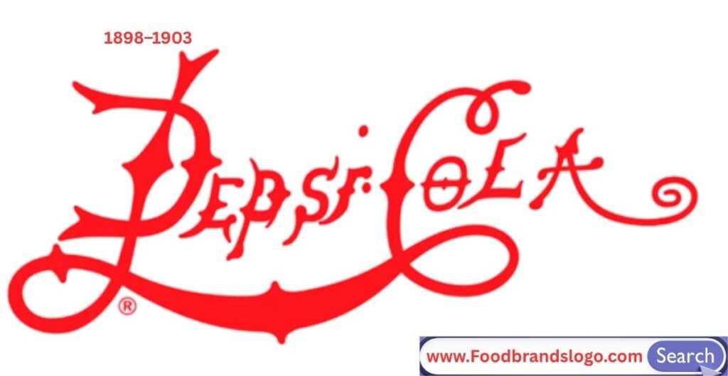
Pepsi’s very first logo was a stylized, script-type wordmark that read “Brad’s Drink,” which was later changed to “Pepsi-Cola” in 1898. The typography resembled the popular Spencerian script, similar to Coca-Cola’s branding. This hand-drawn, ornate font reflected the elegant, apothecary-style origins of soft drinks in the late 19th century.
1903–1904
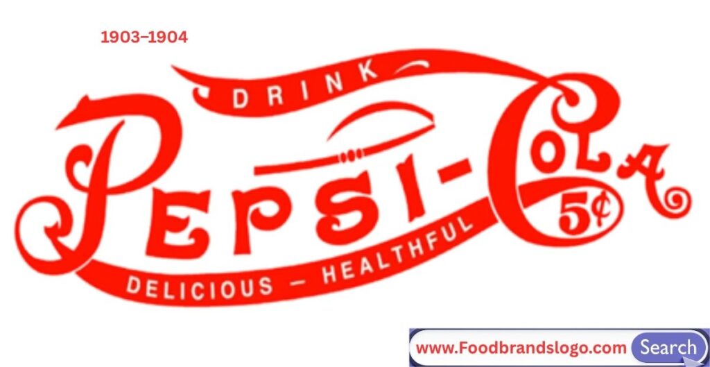
The logo remained script-based but evolved slightly with thicker swirls and flourishes, reinforcing a premium, handcrafted image. This version was still purely typographic, with no added shapes or symbols, reflecting a classic, old-world aesthetic.
1904–1905
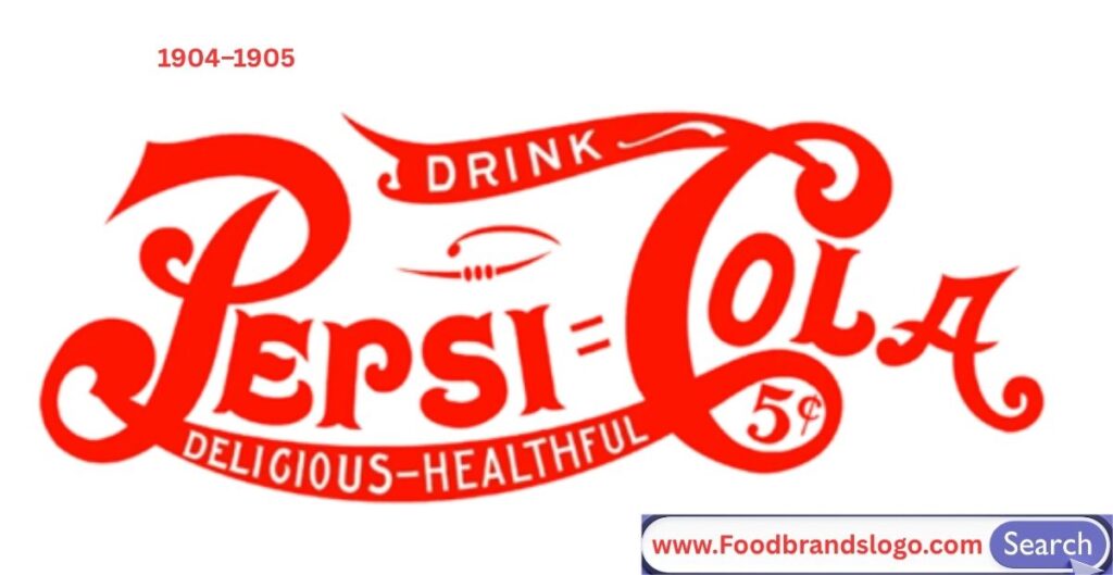
In this short phase, Pepsi’s logo became more refined with sharper script lines and slightly more streamlined letters. It retained the vintage, decorative look but began moving toward a more legible and cleaner style suited for printed advertisements.
1905–1907
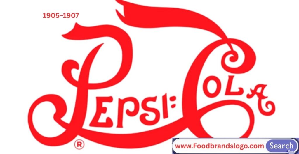
The logo experienced minor enhancements, particularly in letter spacing and curl details. The brand continued using the “Pepsi-Cola” script to build recognition, while subtly modernizing its curves to adapt to mass marketing and packaging.
1907–1934
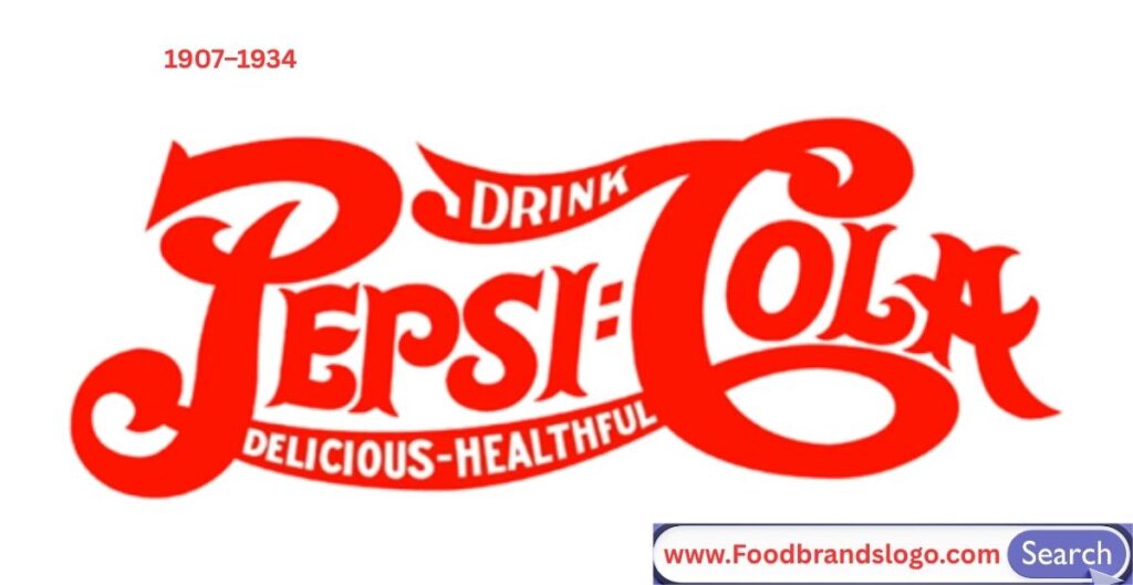
This era saw the longest-running script logo. The design featured a highly stylized and uniform cursive typeface with underlining swashes. It was elegant and iconic, used consistently across signage, print ads, and soda fountains, helping establish brand familiarity and trust.
1934–1951
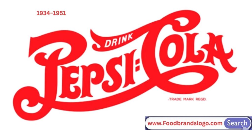
In the mid-1930s, Pepsi introduced a bottle cap background into its logo design, merging the script wordmark with a circular badge. This marked the beginning of a symbol-based identity. The cap represented refreshment and tied the brand to the physical product.
1950–1962
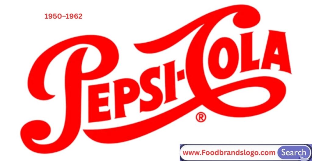
Pepsi modernized its look with a red, white, and blue color scheme to show patriotism post-WWII. The logo featured a flatter bottle cap with bolder outlines, and the script was cleaned up for better readability, setting the foundation for Pepsi’s recognizable visual identity.
1951–1962
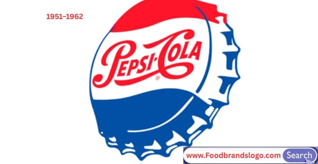
This version fine-tuned the cap’s design and color balance, emphasizing symmetry and clarity. The script wordmark remained, but the overall layout was adjusted to suit mass packaging and advertising in a growing global market.
1962–1969
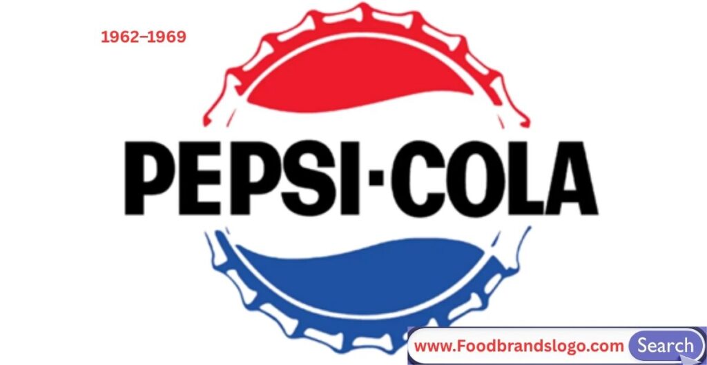
A major shift occurred—Pepsi replaced its script with a bold sans-serif font, completely abandoning the traditional cursive. The bottle cap still remained, but the focus shifted toward a clean, modern identity, signaling Pepsi’s commitment to a youthful and progressive image.
1965–1969
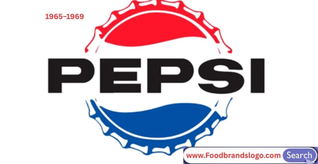
In this era, the brand adjusted its typography further, making the wordmark bolder and more compact, while keeping it inside the bottle cap. This made the logo more versatile for new media formats, including TV and early commercial packaging.
1969–1971
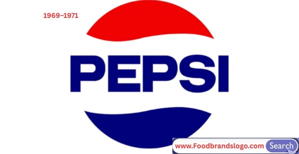
The bottle cap was finally dropped, and Pepsi introduced its first standalone globe symbol—a red, white, and blue circular wave next to the “Pepsi” text. This was the start of the Pepsi Globe, giving the brand a modern, abstract icon that separated it from its script-heavy past.
1971–1987
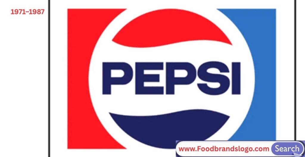
Pepsi doubled down on modernism by refining the globe and bold sans-serif wordmark. The globe and text were usually presented side by side in a horizontal layout, signaling clarity, freshness, and a forward-looking brand voice during a time of rapid globalization.
1987–1991
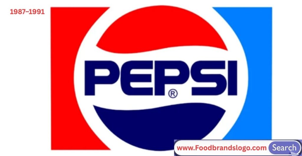
A new font was introduced—blockier and slightly italicized—with tighter spacing between letters. The globe remained consistent, but the typography reflected more energy and sleekness, fitting the late ’80s aesthetic and pop-culture-heavy advertising.
1991–1996
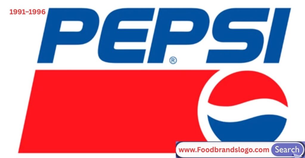
Pepsi shifted to a more energetic and contemporary look, slanting the entire logo diagonally, including the globe and wordmark. This created a sense of motion and boldness, appealing to younger audiences during the height of the “cola wars” with Coca-Cola.
1996–2003
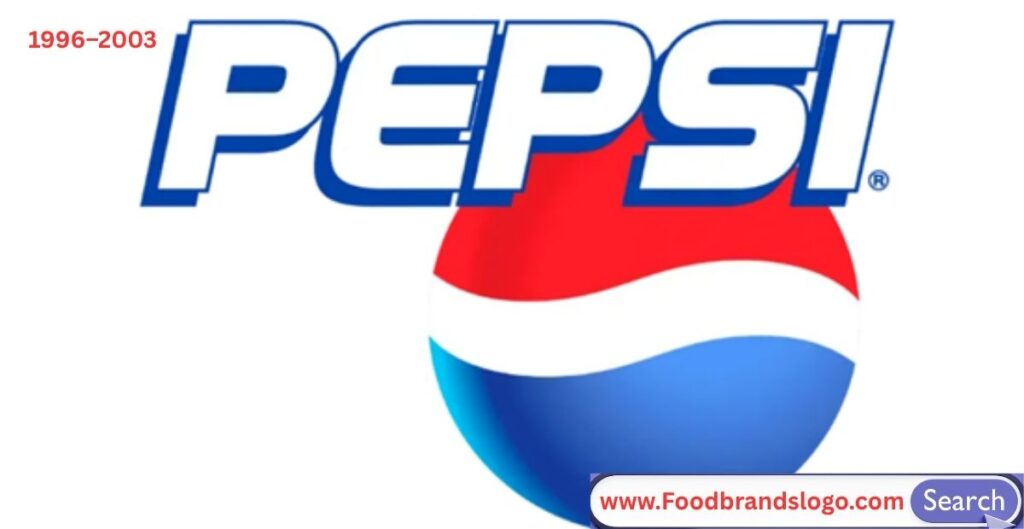
In this era, the logo took on a 3D look with gradients, shadows, and metallic effects. The wordmark featured a dynamic italicized typeface, and the globe gained depth and realism. It reflected the trend toward digital-style branding and energetic, high-impact visuals.
2003–2006
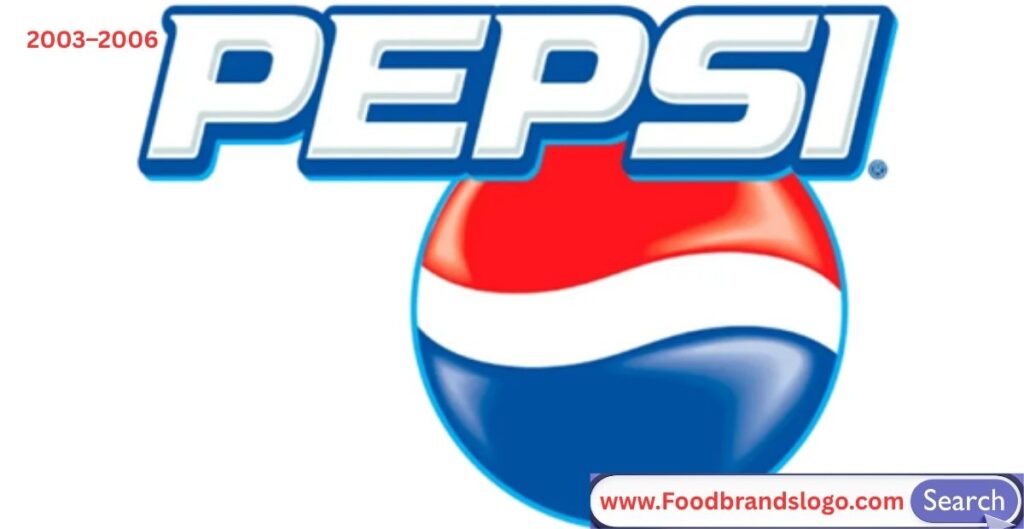
The logo was slightly refined with softer gradients and smoother shapes, moving away from extreme 3D effects. The globe was centered and balanced, while the text became cleaner and more modern, setting the tone for more minimal designs ahead.
2006–2008
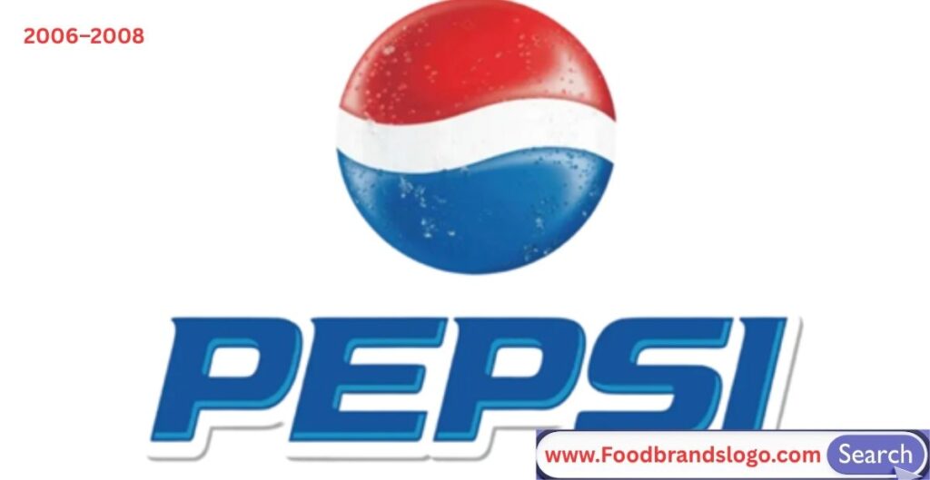
Pepsi moved even closer to flat design, reducing gloss and contrast while keeping the same overall structure. The typeface was subtle and sans-serif, and the globe was simplified in preparation for the major overhaul that followed.
2008–2014
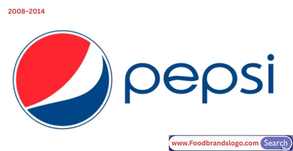
Pepsi unveiled a dramatic redesign: the asymmetrical globe “smile”, with a thinner white wave and a lowercase, minimalist font. The globe symbolized movement and emotion, while the wordmark reflected youth, softness, and digital fluency. It was controversial but visionary.
2014–2023
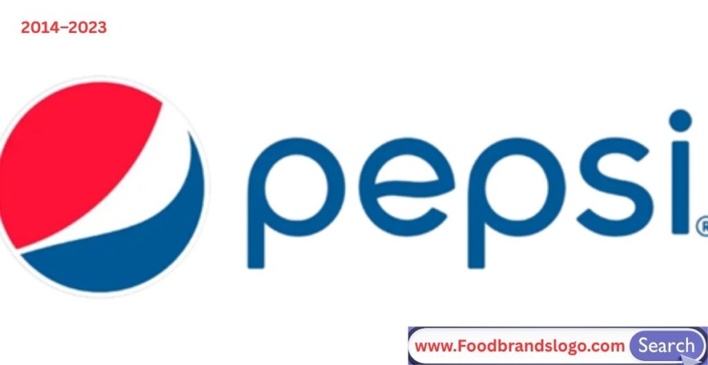
This version refined the previous one with better spacing, richer colors, and improved alignment. It maintained the lowercase style and asymmetrical globe but adjusted proportions for better legibility and visual harmony across devices, platforms, and packaging.
Pepsi Logo 2023
To celebrate 125 years, Pepsi launched a return to boldness and nostalgia. The new logo featured a symmetrical globe with red, white, and blue bands and a bold, all-caps “PEPSI” wordmark inside. It honored the brand’s history while being digital-friendly, striking a balance between retro design and modern needs.
New Pepsi Logo 2024
In 2024, Pepsi officially rolled out its most significant rebranding effort in over a decade. After unveiling a preview of the updated logo in 2023 as part of its 125th anniversary, the full rollout began across packaging, advertising, vending machines, social platforms, and retail displays around the world.
So, what changed — and why did it matter?
Back to the Future: A Retro-Inspired Reinvention
The Pepsi logo 2024 is not just a redesign — it’s a rebirth. The new look brings back several key visual elements from the 1970s–1990s era, which many fans and branding experts consider Pepsi’s most iconic period. But instead of simply copying the old logo, Pepsi reimagined it with modern boldness and precision.
At the heart of the logo is a symmetrical, circular globe—featuring bold bands of red on top, white in the middle, and blue on the bottom, with the classic wave pattern. Unlike the “smile” motif introduced in 2008, the wave is now precisely centered and curved, creating a much more balanced and familiar aesthetic.
Inside the globe is the standout feature: the word “PEPSI” in all caps, centered vertically and horizontally in bold sans-serif type. This was a dramatic departure from the minimalist, lowercase wordmark of previous years. It commands attention and instantly evokes nostalgia — yet it feels entirely fresh.
The typeface itself is thick, geometric, and powerful. It creates a strong contrast against the red and blue halves of the globe, making the name visible even from a distance or on small screens.
Design Enhancements for the Digital Age
The 2024 redesign is not just about looks. Pepsi worked with global branding teams to ensure the new logo performs perfectly across every digital and physical platform.
Some digital-first enhancements include:
- Scalability: The logo looks sharp whether it’s on a smartwatch app or a billboard.
- High contrast: The black text inside the colored globe improves legibility in all environments.
- Animated assets: Pepsi also released motion versions of the logo, with the globe rotating or pulsing, used in video ads and on social media.
This digital-friendly design helps Pepsi stay culturally agile in an era where logos need to work as app icons, Instagram filters, digital stickers, and dynamic campaign graphics.
A Refreshed Color Palette
The 2024 Pepsi color palette includes deeper, more saturated tones:
- Pepsi Blue: Now darker and more authoritative, making the design feel modern and premium.
- Crimson Red: Bolder and more eye-catching, ideal for shelf visibility.
- Bright White: Used to create clean space and visual balance.
- Black Accent: Introduced to make the wordmark pop — especially important for Pepsi Zero Sugar and digital use.
Together, these colors create a high-contrast identity that stands out on screens and in stores, while still feeling unmistakably “Pepsi.”
Packaging and Brand World
With the 2024 logo came a complete overhaul of Pepsi’s packaging and branding assets. Cans, bottles, and cartons now feature:
- The new globe in larger sizes for maximum impact.
- Matte finishes and minimal backgrounds to let the logo shine.
- Clear product differentiation — for example, black backgrounds for Pepsi Zero Sugar, using the same logo but with darker vibes.
Pepsi also updated its vending machines, delivery trucks, merchandise, and signage to reflect the new identity — part of its push to appear more unified and modern across all consumer touchpoints.
Why This Logo Resonates
The Pepsi logo 2024 strikes a rare balance: it’s modern and nostalgic, bold and approachable, structured and flexible. It respects the past but looks to the future — exactly what global brands need to do to stay relevant.
Here’s what makes this logo especially powerful:
- It acknowledges consumer nostalgia by drawing from an iconic era.
- It prioritizes clarity and functionality, especially for digital media.
- It allows Pepsi to communicate consistency across product lines (original, diet, zero, etc.).
- It amplifies Pepsi’s brand voice: fun, energetic, confident, and cool.
In short, the 2024 Pepsi logo isn’t just a visual upgrade — it’s a strategic move to own Pepsi’s legacy while leading it into the future.
Logo Design Elements
Color
Color is the soul of the Pepsi logo. Its signature red, white, and blue palette isn’t just eye-catching — it’s symbolic, historical, and deeply embedded in the brand’s DNA.
- Red evokes energy, passion, and boldness. It grabs attention and brings warmth to the design.
- White adds clarity, neutrality, and balance. It acts as a visual divider between the top and bottom portions of the globe.
- Blue symbolizes refreshment, trust, and dependability. It’s calming and cool — aligning with the beverage’s refreshing nature.
The 2024 logo update deepened the blue to create more contrast and visual authority. The red is now more vivid, and white is used sparingly to keep the design clean. For products like Pepsi Zero Sugar, black is also used in the color scheme to reflect a bold, modern feel and help differentiate SKUs.
Together, this color system supports versatility while keeping brand recognition intact across shelves, screens, and experiences.
Shape
The Pepsi logo’s most enduring shape is the circle, also known as the Pepsi Globe. Originally inspired by a bottle cap in the 1940s, this circular motif has grown into a global icon.
The globe represents:
- Unity and global reach
- Continuity and balance
- Movement and energy (especially when paired with the dynamic wave through the center)
In the 2024 design, Pepsi returned to a more symmetrical version of the globe with the classic wave dividing red (top), white (middle), and blue (bottom). This version feels intentional and grounded, restoring visual stability after the asymmetrical 2008–2023 “smile” globe.
The circle also scales beautifully — from soda cans to smartphone apps — and works seamlessly across print and digital environments.
Fonts (Typography)
Typography has changed more than almost any other element in Pepsi’s history. Over the decades, Pepsi has used:
- Cursive script in its earliest days (1898–1940s)
- Bold, condensed sans-serif fonts in the mid-20th century
- Italic, slanted fonts in the energetic 1990s
- Rounded, lowercase fonts in the minimalist 2008 redesign
- And now, in 2024, a return to bold all-caps sans-serif typography.
This latest wordmark — centered directly inside the globe — is geometric, confident, and clean. It uses strong lines and a compressed letter width to fit neatly within the globe’s constraints, creating balance and punch.
This font evokes the golden era of Pepsi (1970s–1990s) while giving the type a more digital-ready presence. It works perfectly on mobile apps, merchandise, vending machines, and digital billboards.
Format and Versatility
A successful modern logo needs to be modular—adaptable across formats, platforms, and contexts. Pepsi’s current identity does this exceptionally well.
The Pepsi Globe can be used:
- With the wordmark inside (primary version)
- As a standalone icon (for digital avatars, app icons, caps)
- With vertical or horizontal lockups depending on the layout needs
This flexible structure allows Pepsi to stay visually consistent without being creatively rigid. Whether it’s a high-res billboard or a minimalist can design, the logo delivers.
Pepsi also supports a range of professional formats:
- SVG & EPS for scalability and precision
- PNG for transparent backgrounds
- PDF & AI for print and design use
- Motion files (MP4, GIF, etc.) for animated use in ads and online content
The brand ensures global consistency through strict brand guidelines, making the Pepsi logo one of the most successfully implemented marks in the world.
Pepsi Slogan
Though not part of the logo itself, Pepsi’s slogans often complement and elevate its visual identity. They help tell the story behind the brand’s evolving personality.
Here are some of Pepsi’s most iconic slogans over the years:
- “The Choice of a New Generation” (1984) – Focused on youth and cultural cool.
- “Generation Next” (1997) – Highlighting tech-savvy, forward-thinking consumers.
- “Live for Now” (2012–2017) – Emphasizing spontaneity and presence.
- “That’s What I Like” (2020s) – Tapping into self-expression and authenticity.
- “Thirsty for More” (recent campaigns) – Designed to provoke curiosity and energy.
Each slogan plays a supportive role in shaping how the Pepsi logo is perceived — from energetic and youthful to bold and adventurous.
Conclusion
The Pepsi logo is more than a design—it’s a visual journey through over a century of branding evolution. From a swirly script in the late 1800s to the dynamic globe of 2024, Pepsi’s logo changes have always reflected its mission to stay bold, innovative, and in tune with culture.
Its design elements—color, shape, font, and format—work together to create a lasting impression. And behind every redesign is a story of marketing genius, consumer trends, and design revolutions.
So next time you pop open a Pepsi, take a second look at that logo. It carries 130 years of history in a single swirl.
FAQs
What does the Pepsi logo represent in 2023?
The 2023 Pepsi logo represents a return to the brand’s iconic roots while embracing a modern design aesthetic. It features a bold red, white, and blue circular globe with a centrally placed all-caps “PEPSI” wordmark. The symmetrical globe signifies balance, unity, and brand legacy, while the design appeals to both nostalgia and digital clarity.
Why did Pepsi change its logo in 2023?
Pepsi updated its logo in 2023 to celebrate its 125th anniversary and reconnect with its most memorable brand era. The change brings back a retro-inspired look that reflects Pepsi’s heritage while enhancing visibility, digital adaptability, and global recognition. It was also designed to work more seamlessly across platforms, packaging, and devices.
What font does the new Pepsi logo use?
The 2023 Pepsi logo features a bold, condensed, all-caps sans-serif typeface. While it is a custom font made specifically for the Pepsi brand, it closely resembles geometric, modern sans-serif fonts used for strong, clear brand identities. The font sits centered within the globe, giving the logo structure and impact.
Is the new Pepsi logo available globally?
Yes, the 2023 Pepsi logo was launched as a global brand refresh. It appears across all major markets on bottles, cans, advertisements, social media, and vending machines. The uniform branding helps Pepsi maintain a consistent visual identity worldwide.
How is the 2023 Pepsi logo different from the 2008 version?
The 2008 Pepsi logo introduced an abstract “smile” globe and lowercase typography, symbolizing youth and energy. In contrast, the 2023 version brings back the classic circular globe with even red, white, and blue segments and a strong uppercase wordmark inside the globe. It’s symmetrical, bolder, and more digitally adaptable.