
Introduction
Consider your preferred soft drinks. The logo is probably among the first things that come to mind because it is striking, vibrant, and readily identifiable. It’s the same for Fanta. Fanta is one of the most recognizable soft beverages in the world, and its branding has always emphasized fruitiness, fun, and freshness. The Fanta logo is at the center of that branding.
However, have you ever pondered the origins of the Fanta logo? What does it actually imply, and how has it changed throughout the years? This article will examine the intriguing history of the Fanta logo, from its German origins during the war to its contemporary, vibrant designs.
Discover the meaning, color psychology, design development, and backstories of every logo it has had over the years. This is for you if you’re interested in branding, design, marketing, or simply want to know what your favorite orange beverage is.
Fanta Logo Symbol, Meaning, Evolution, History | All Years
Meaning and History
There has always been more to the Fanta logo than just the name. It serves as a graphic representation of the qualities that the beverage embodies: playfulness, refreshment, and youthful vitality. Fanta, which is owned by The Coca-Cola Company, has appealed to a wide range of age groups and cultural preferences with its logo. The Fanta logo evolved along with the tastes of its customers.
Let’s examine each phase of the logo’s evolution in detail:
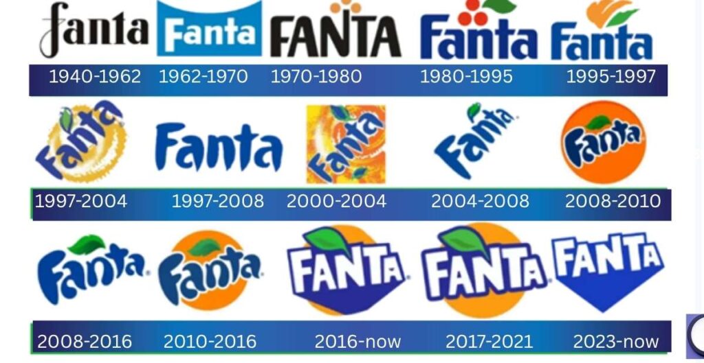
1940 – 1962: The Birth of Fanta

During World War II, when Coca-Cola’s German division was isolated from its American headquarters, the Fanta brand was born in Nazi Germany. Drawing inspiration from the German term “Fantasie” (meaning imagination), the name “Fanta” reflected the impromptu components used to manufacture the beverage.
The original Fanta logo was a simple, minimalist wordmark that was mostly typographic and devoid of any whimsical or fruity components.
Visual Impact: The design was conservative and functional, devoid of color and personality, as a result of wartime shortages.
Although there wasn’t much to appreciate aesthetically, this time period established the groundwork for a beverage that would eventually become popular all over the world.
1962 – 1970: Post-War Global Expansion
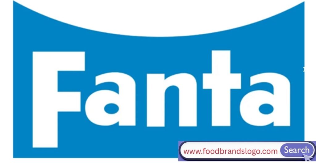
Coca-Cola reintroduced Fanta to the world in the 1960s. A more unified identity started to emerge in the logo.
Design Shift: Lowercase letters with a rounder, softer appearance are introduced.
Use of Color: Citrus flavors began to emerge through hints of orange and blue.
The goal of this iteration of the Fanta logo was to depart from its sinister beginnings and embrace a more modern, global appeal.
1970 – 1980: Bold and Youthful

Fanta didn’t lag behind the beverage industry’s increasingly expressive logo scene during this decade.
Evolution of the Logo: The logo incorporated stylistic graphics, such as orange slice-like parts, and more vibrant hues.
Symbolism: It represented happiness, fruit, and sunshine—elements that appealed to teenagers and young people.
This iteration started to position Fanta as an enjoyable, informal, and social beverage.
1980 – 1995: Playful Meets Bold

Fanta was well-known in several nations by the 1980s. Its logo became increasingly daring and avant-garde.
Typography: The font became more fun and chunkier.
Logo Shape: To represent excitement and fizz, some designs even included wavy lines and bubble shapes.
With the help of its constantly changing logo, the brand established itself as the preferred beverage for an enjoyable living.
1995 – 1997: Compact and Fruity

The logo changed to a smaller style for a brief but important period.
Iconography: The logo had a tiny orange sign above or within it.
Colors: To symbolize fruit and the natural world, vivid orange and green stood out.
This was a significant turning point when color began to play a big part in brand awareness.
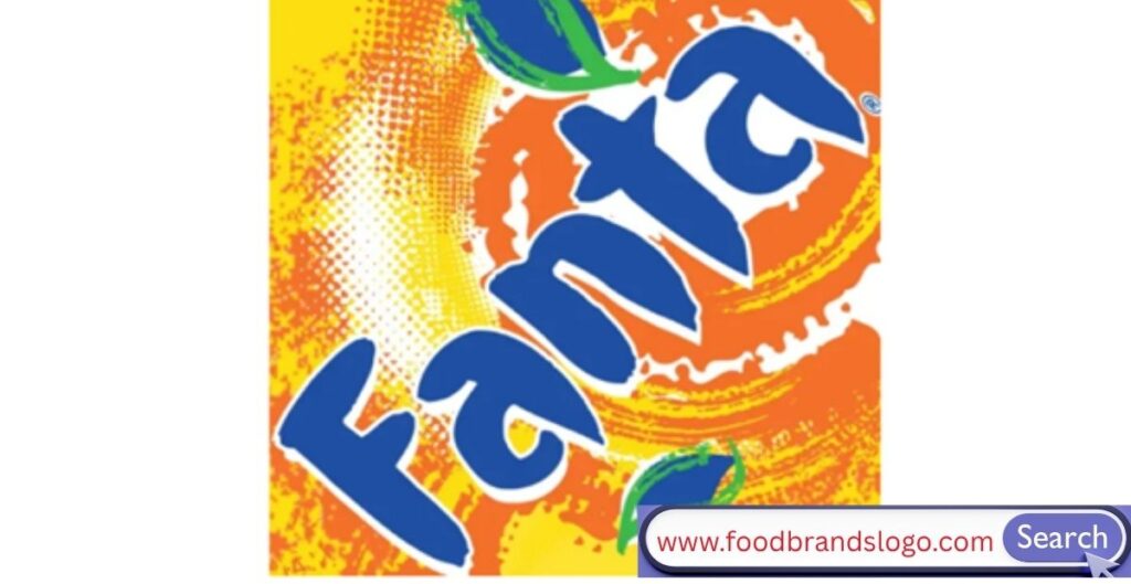
1997 – 2004: Wavy Wordmark and Vibrant Colors

One of the biggest visual changes in the development of the Fanta logo occurred at this time.
Wordmark Design: Exaggerated waves and curved characters conveyed movement and pleasure.
Brand Imagery: The logo exploded with vitality thanks to the addition of raindrops, fruit forms, and juice splashes.
It reflected the late 1990s corporate branding fads of being loud, bright, and bold.
1997 – 2008: Regional Logo Variations
It’s interesting to note that Coca-Cola experimented with localized Fanta logos throughout this period.
Localization: While some nations’ logos were flat, others had gradients and 3D effects.
Visual Identity: Orange and blue remained the brand’s primary colors in spite of stylistic variations.
This stage of brand differentiation experimentation tested what appealed to various markets the most.
2000 – 2004: Bubble & Splash Era
The early 2000s welcomed the progress of graphic design with vigor and movement.
Design features include an orange slice behind the wordmark, splash graphics, and glittering bubbles.
Typography: More curved and flowing, yet still bold.
For millennials, this iteration of the Fanta logo became one of the most recognizable.
2004 – 2008: Clean and Youth-Centric

As digital and mobile design gained popularity, logos began to adjust to the aesthetics of screens.
Flat Design: A simpler arrangement with crisper edges and less ornamentation.
Color psychology: Blue and orange were purposefully employed to arouse trust and thirst, respectively.
It was a simpler, more adaptable logo that worked well with many types of packaging.
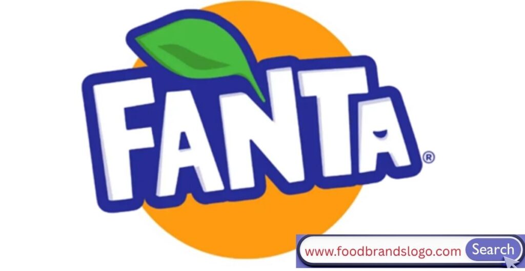
2008 – 2010: Flavorful Expression
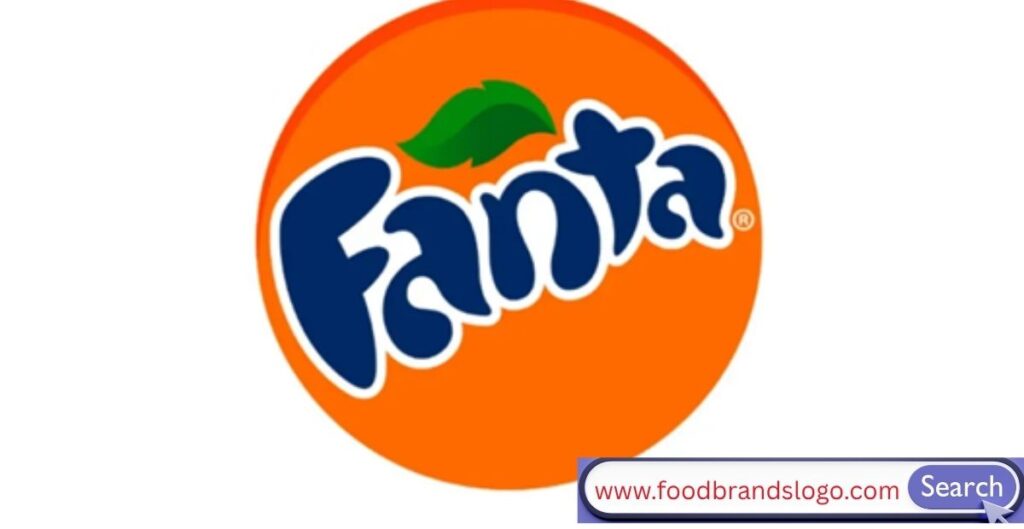
This brief iteration of the logo was incredibly expressive.
Icon Additions: An orange ball, splash, and leaf were added.
Font Selection: Personalized handwritten font to satisfy Gen Z’s desire for genuineness.
It was vibrant and expressive, perfectly capturing the current trends in orange beverage logo design.
2008 – 2016: Bolder and Flatter
In this overlapping phase, Fanta’s logo underwent a bold modernization.
- Logo Style: Transition from 3D effects to flat design.
- Design Trends: A nod to minimalism while retaining youthful energy.
This period focused on making the logo aesthetics more consistent globally.
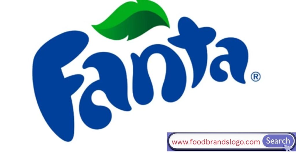
2010 – 2016: Refined and Geometric
The typography evolved again, this time with more symmetry and rounded edges.
- Leaf Element: A bold green leaf sat above the ‘n’—a small detail with major symbolic weight.
- Corporate Identity: The brand leaned more into environmental consciousness.
The refined design marked a mature phase in Fanta’s branding journey.
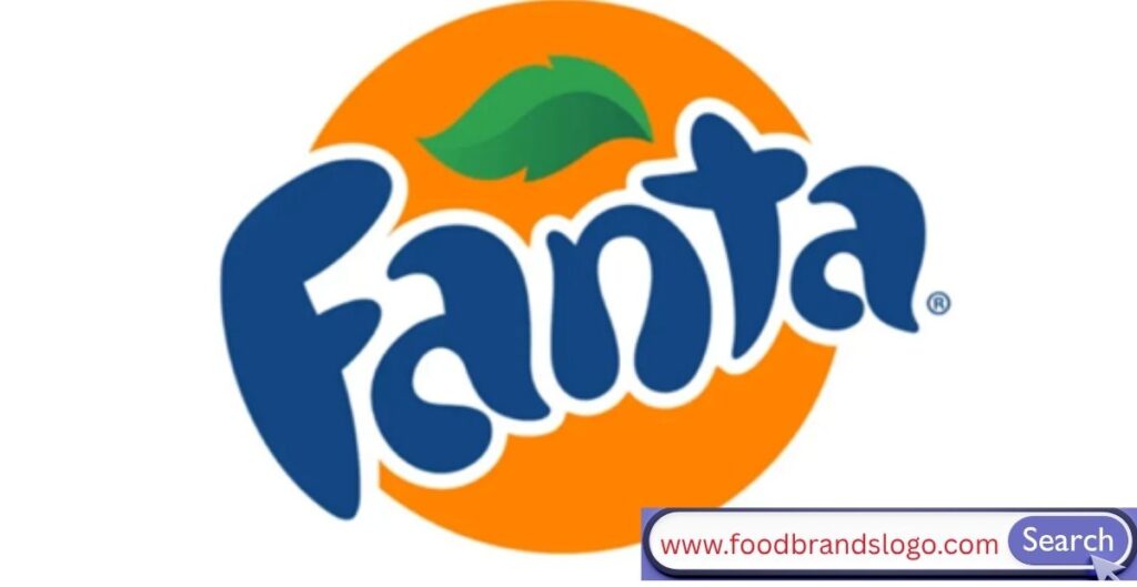
2016: The Iconic Redesign

2016 was a monumental year. Fanta revealed a logo that was both playful and structured.
- Geometric Shapes: The letters were shaped like cutout stencils.
- Design Elements: A citrus leaf still hovered over the “n,” while the colors popped in high-contrast tones.
This redesign was a clear attempt to align with logo modernization trends—flat, versatile, and adaptable across digital platforms.
2017 – 2021: Simpler and Stronger
The redesign refined the already-iconic 2016 look.
- Typography: Slimmer, more defined characters.
- Visual Branding: Less cluttered and easier to scale across mediums.
This version stayed true to the Fanta brand identity, keeping its charm intact while being ultra-optimized for mobile and global recognition.
2023 – 2024: Minimal and Clean

In the most recent update, the Fanta logo has fully embraced modern minimalism.
- Design Philosophy: A flat logo with clear-cut shapes, sans shadows, or effects.
- Logo Symbolism: Still retains the playful font and citrus element, but stripped down for clarity.
It’s a perfect balance of tradition and future-forward design, encapsulating decades of logo evolution.
Font and Colors
Fanta Color Code
Color plays a massive role in Fanta’s branding. Here’s what’s always stood out:
- Orange (#FF8300): Symbolizes citrus fruit, energy, fun, and freshness.
- Blue (#0033A0): Used to represent trust, coolness, and refreshment.
- Green (#5CB712): Often seen in the leaf symbol, representing nature and fruit origin.
These colors contribute to color psychology in beverage branding, helping the product look both appealing and refreshing.
Shape
The Fanta logo’s shape has often varied from circular fruit representations to wavy wordmarks and more geometric forms.
- Circular Forms: Represent unity and fruit.
- Wave Elements: Represent fluidity and fun.
- Geometric Fonts: Represent structure and modernity.
Each phase of the logo used shape as symbolism—helping to express a different emotional layer of the brand.
Fanta Hidden Story
Did you know that the dot above the “i” in some older Fanta logos was a citrus fruit? Or that the curve of the font mimics the swirl of juice being poured?
These small design Easter eggs have always been part of Fanta’s charm:
- The Leaf: Not just decoration—it implies natural ingredients and freshness.
- The Orange Slice: Suggests flavor and fun in a single graphic.
- Playful Font: A nod to youthful energy, spontaneity, and joy.
Fanta’s logo tells a story even when you don’t realize it.
Fanta Facts
Here are some quick facts to satisfy your logo-loving brain:
- Fanta was originally made from leftover apple fibers and whey.
- The original Fanta logo had no color—it was simply text-based.
- The brand is now sold in over 190 countries.
- The 2016 redesign was created by Koto Studio in collaboration with Coca-Cola.
- Fanta is Coca-Cola’s second-oldest brand.
Fanta isn’t just an orange soda—it’s a design case study in how to adapt, evolve, and thrive through branding.
Conclusion
The Fanta logo has seen it all, from Nazi Germany to Instagram today. Millions of people now identify it as a strong, colorful, and playful icon that has changed from a straightforward, text-based wordmark.
Its development is similar to that of branding in that it has adjusted to audience expectations, trends, and technological advancements. Fanta’s essential characteristics—fun, freshness, and refreshment—have remained same throughout each iteration.
The next time you open a Fanta, pause to consider the meaning behind that happy label logo. Additionally, if you’re a marketer, designer, or brand aficionado, keep in mind that Fanta’s logo evolution offers a wealth of lessons.
FAQs
What does the Fanta logo represent?
The Fanta logo represents youth, energy, and fruity freshness. Over the years, it’s evolved to visually embody joy, citrus flavor, and spontaneity, using playful fonts, vibrant colors, and refreshing elements like splashes and fruit slices.
When was the Fanta logo created?
The original Fanta logo was introduced in 1940 during World War II. It was a simple, no-frills design used in Nazi Germany, where the drink was first created due to Coca-Cola’s supply shortages.
Why does the Fanta logo have a leaf?
The leaf above the “n” in the modern Fanta logo symbolizes natural fruit ingredients and freshness. It’s a subtle yet powerful nod to the drink’s citrus roots and playful identity.
How many times has the Fanta logo changed?
The Fanta logo has changed over a dozen times since its creation. Key redesigns happened in the 1960s, 1980s, 1990s, 2000s, and 2016, with the most recent version arriving in 2023–2024 as a cleaner, minimalist update.
Who designed the modern Fanta logo?
The 2016 redesign of the Fanta logo was created by Koto Studio in collaboration with Coca-Cola’s global design team. It introduced geometric shapes and a more playful, structured layout, which later evolved into the current flat, digital-friendly version.
What font does the Fanta logo use?
Fanta uses a custom geometric and playful font tailored specifically for the brand. It’s not publicly available but was designed to express youthfulness, boldness, and movement in every character.
What are the official Fanta logo colors?
The Fanta logo typically uses orange (#FF8300) to represent flavor and fruit, blue (#0033A0) for refreshment and contrast, and green (#5CB712) to signify the citrus leaf and natural appeal.
How does the Fanta logo reflect the brand’s personality?
Fanta’s logo mirrors its personality by using quirky, lively shapes and bright, energetic colors. It emphasizes youth, fun, and creativity—appealing strongly to teens and young adults across generations.