
Introduction
Have you ever pondered why the Mountain Dew emblem appears so captivating? More than just a soda, Mountain Dew is a representation of robust flavor, high-energy branding, and adventurous activities, whether you’ve picked up a can for a late-night game or sipped it while traveling. The centerpiece of it all is a logo that has seen significant change throughout the years.
The Mountain Dew logo has undergone numerous colorful changes from its modest origins as a local beverage in Tennessee to its current status as a worldwide symbol under PepsiCo. The meaning of the Mountain Dew logo, its development, and its relationship to slogans, brand history, facts, and much more will all be covered in this post.
Whether you’re a branding enthusiast, a soda fan, or just curious about how logos evolve with time, you’re in for a zesty ride.
Meaning and History
The soul of the brand is embodied by the Mountain Dew emblem, which is more than just a label placed on a bottle. Mountain Dew was first developed in the 1940s as a lemon-lime whiskey mixture with the intention of “ticking your innards.” Its meaning changed throughout time to stand for audacity, youth culture, and active lifestyles.
Moonshine was the colloquial term for “Mountain Dew.” The tone for a company that never played it safe was established by that chaotic beginning. The meaning of the logo has always centered on:
- Excitement and energy: From hillbilly illustrations to neon colors and sharp fonts.
- Rebellion and youth: Especially after the 1990s when the brand redefined itself through extreme sports and gaming.
- Freshness and flavor: The citrusy green palette echoes the tangy taste inside.
As Mountain Dew evolved, so did its identity—from Appalachian roots to a modern pop culture staple.
Mountain Dew Logo Evolution
The Mountain Dew logo has changed to reflect the tastes of each generation, just like the beverage itself. As a result of cultural changes and marketing demands, it has evolved from being eccentric and homegrown to being modern and dynamic.
Every redesign offered a calculated update to draw in new customers while preserving the brand’s distinctive audacity. Let’s examine each year separately.
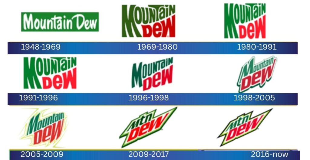
Mountain Dew Logo History
1948 – 1969: The Original Hillbilly Era
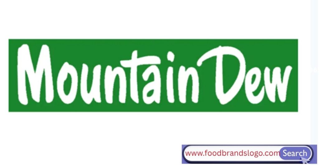
The original Mountain Dew logo featured a whimsical, earthy style. It had an image of an elderly hillbilly with a gun and the words “Ya-Hoo! Mountain Dew…” It will make your insides tingle! The hand-drawn, curly font was a fantastic match with the Appalachian vibe.
This version, which was promoted by the Tip Corporation, honored its origins in Knoxville, Tennessee. Despite being archaic by today’s standards, it was successful in creating a distinct brand within the soda market.
1969 – 1980: Corporate Cleanup Under PepsiCo
The first significant alteration to the design occurred in 1964, following PepsiCo’s acquisition of Mountain Dew. The business abandoned the hillbilly mascot in 1969 in favor of a more contemporary, clean wordmark.
The backwoods motif was abandoned in favor of bold, emphasized letters with sharp serifs that suggested motion and enthusiasm. The brand began focusing on a wider, younger demographic.
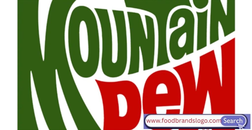
1980 – 1991: New Energy, Sharper Look
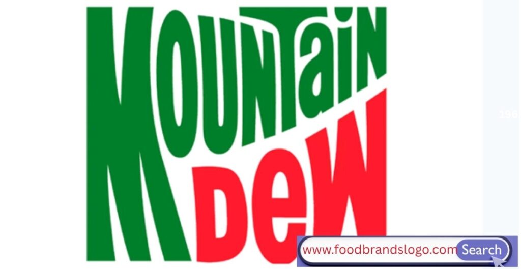
In the 1980s, designers introduced the logo’s compact shape and recognizable red and green color scheme. They made the font more stylistic, bolder, and blockier. This upgrade reflected the soda’s reinvention as a beverage for active and energetic consumers.
The mood was more sporty and irreverent, and the colors were more vibrant. It complemented the brand’s caffeine spike visually.
1991 – 1996: Edgy and Compact
The logo became considerably more aggressive throughout this era. The scrunched-together letters emphasized passion and speed. It alluded to the upcoming explosion of alternative youth culture and action sports, which the brand will soon fully embrace.
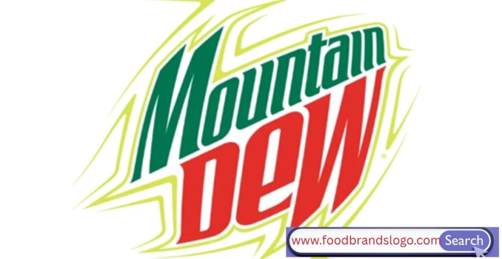
1996 – 1998: Angled and Intense
The emblem now had a distorted, high-octane appearance and was tilted diagonally. To make it stand out, gradients were applied and the lettering became sharper. It exuded vitality and excitement, perfectly aligning with the brand’s advertising campaigns that highlighted snowboarding, skateboarding, and mountain biking.
1998 – 2005: The Smash Hit
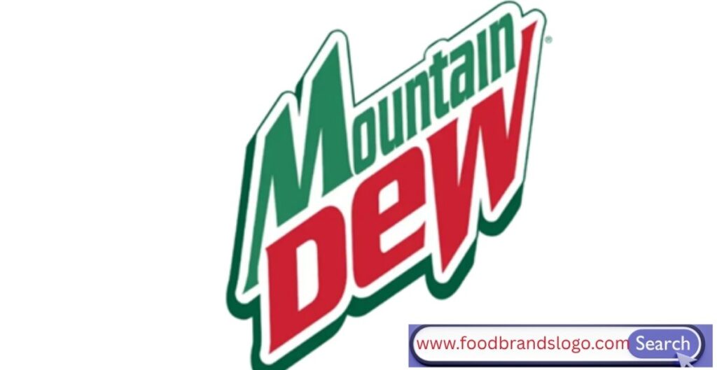
For fans, this is one of the more familiar versions. It appeared as though a visual punch had shattered the wordmark forward. The letters erupted off the background as bright red and green clashed over a dark border.
It was loud, edgy, and confrontational—exactly what Mountain Dew needed to take control of a cutthroat beverage market and solidify its position in action sports and gaming.
2005 – 2009: Polished and Youthful
The brand shifted toward a more tech-savvy, digital look around the middle of the 2000s. The revamp added a smoother, more polished feel while keeping the dynamic layout. Lines became crisper and shadows were lessened.
It worked effectively in digital advertisements, retail, and packaging because it struck a balance between extreme and professional.
2009 – 2017: Welcome MTN Dew
In a bold move, Mountain Dew shortened its logo to “MTN Dew,” aiming for simplicity and speed. The design echoed text-speak, appealing to the smartphone generation. The angle remained, but the form became minimalist.
This was the logo of Twitch streams, eSports arenas, and fast-paced internet culture.
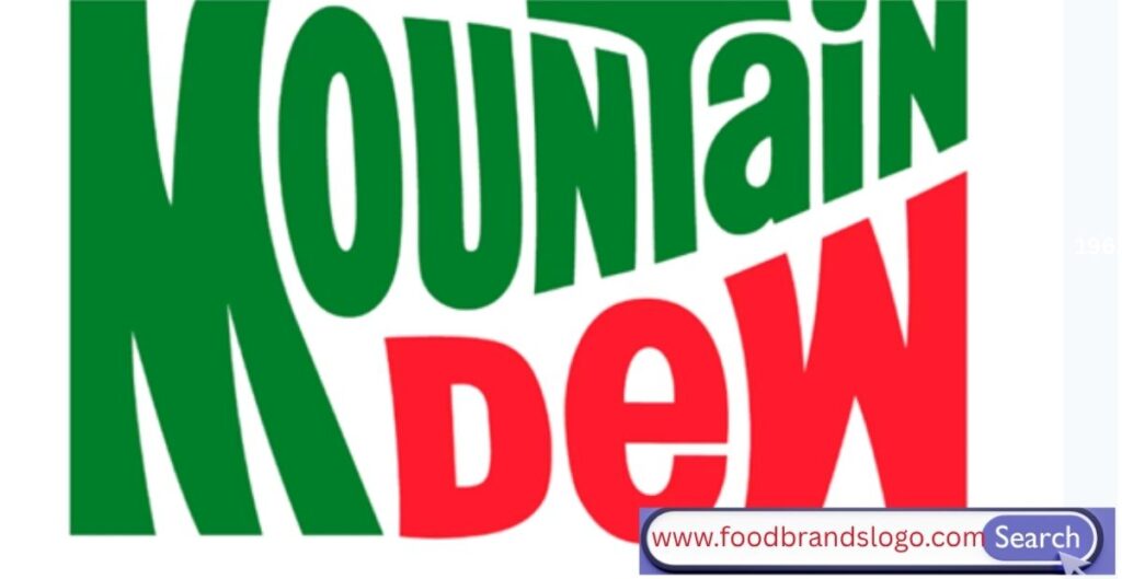
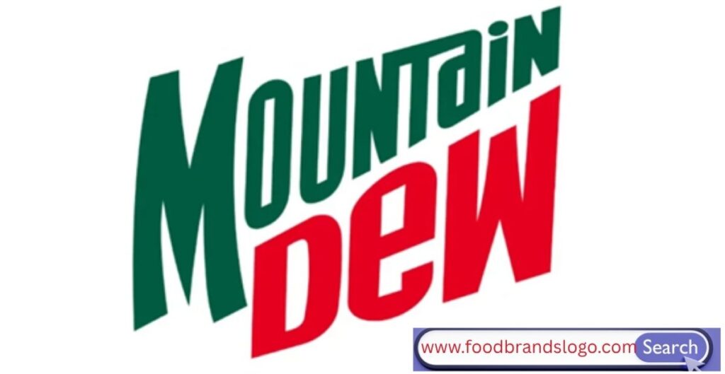
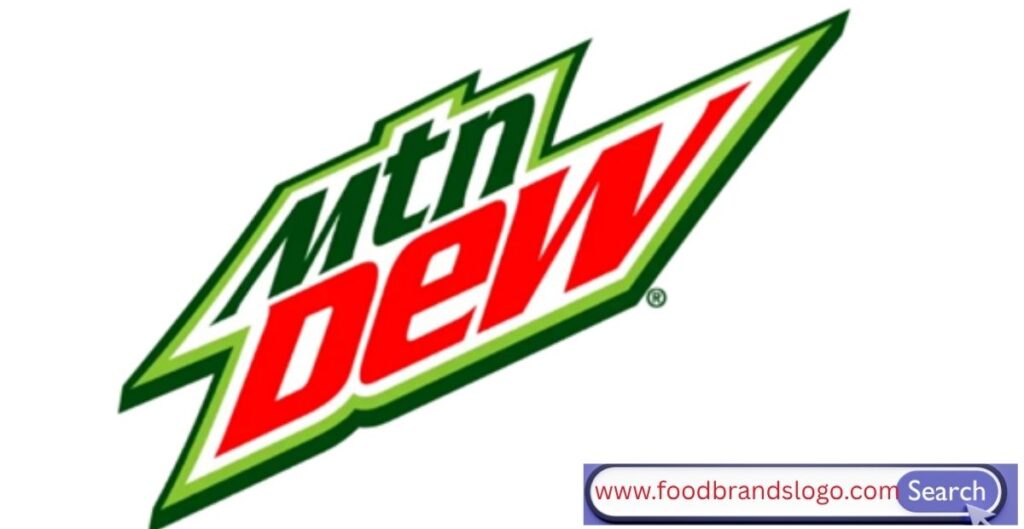
2016 – Today: Modern Minimalism
The current design simplifies the color scheme and typeface while maintaining the “MTN Dew” acronym. It is clear, sharp, and screen-adaptable.
Sharp corners, striking contrasts, and contemporary sans-serif fonts give it an instantly recognizable style, but despite its minimalism, it nevertheless exudes energy. The branding remains vivid and consistent whether it’s a transparent PNG for a design or a can in your refrigerator. A component in logo design
Color
Mountain Dew’s iconic green dominates the logo—and that’s no accident. It represents:
- Lime and citrus flavor
- Freshness
- Natural ingredients
Red is used as an accent to boost energy and draw attention. The two-tone combo of green and red has become synonymous with the brand, helping it stand out on shelves.
White and black backgrounds are used for contrast, depending on the product (Zero Sugar, Baja Blast, etc.).
Font
From quirky hand-drawn to futuristic sans-serif, the Mountain Dew logo fonts have evolved dramatically. The modern font is:
- Bold
- Sans-serif
- All-caps
- Angled and thick
This design conveys speed, energy, and power—perfect for a brand aimed at movers, gamers, and thrill-seekers.
Format
The Mountain Dew logo is now available in multiple design formats:
- PNG format: Great for websites and transparent use
- Vector logo/SVG: Ideal for scalable printing and merchandise
- Square logo: Used in digital apps and mobile displays
These flexible assets ensure brand consistency whether it’s on a vending machine or a TikTok ad.
Mountain Dew Slogan
Mountain Dew’s slogans are legendary—and often bold. Here’s how they evolved:
- “Ya-Hoo! Mountain Dew… It’ll tickle your innards!” – 1950s hillbilly charm.
- “Do the Dew” – Launched in the ’90s, it became iconic and globally recognized.
- “Fuel Up for Battle” – Game Fuel’s campaign slogan targeted competitive gamers.
- “Get that Dew Feeling” – Used in various international markets.
- “DEW it with passion” – A nod to individuality and action.
Each slogan reinforced the brand’s youthful, daring identity. “Do the Dew” remains one of the most successful beverage slogans of all time.
Mountain Dew Facts
Here are some astounding facts about Mountain Dew that you most likely were unaware of:
Origin: Founded in the 1940s in Knoxville, Tennessee.
Barney and Ally Hartman were its founders; the Tip Corporation later developed it.
Purchased: In 1964, PepsiCo purchased it.
Its original purpose was to blend with whiskey.
Caffeine: More caffeine than Pepsi or Coca-Cola.
More than 40 flavors are available worldwide, such as Baja Blast, Code Red, and Pitch Black.
In 2004, Baja Blast was developed specifically for Taco Bell.
One of the first beverage companies to support gaming competitions was eSports.
Mountain Dew Amp Game Fuel is a series of products specifically designed for gamers.
Streetwear and merchandise: Limited-edition partnerships with companies such as Nike and Faze Clan.
Mountain Dew Story
The tale of Mountain Dew is as vibrant as its fizz. It started out as a drink manufactured out of necessity when the Hartman brothers made their own soda mixer because they couldn’t easily find them in Tennessee.
The robust taste and eccentric branding immediately became well-known. PepsiCo recognized the brand’s potential for widespread appeal when they purchased it in 1964.
The 1980s and 1990s were crucial years. Sports, skate culture, and later video games were all embraced by Mountain Dew. They honed their target demographic—young adults and teens seeking something interesting, novel, and fun—with every successive campaign.
The story of Mountain Dew is about more than simply a beverage; it’s about a shift in culture. Through adaptation, evolution, and leadership in high-energy branding, it went from moonshine mixers to esports sponsorships.
Conclusion
A compelling tale of reinvention is conveyed by the Mountain Dew logo. It’s a case study of how brands develop, change, and maintain their spark, not just a vibrant whirl of color.
Every makeover has taken into account marketing genius and cultural changes, from its hillbilly beginnings to its digital-age abbreviation, “MTN Dew.” Mountain Dew continues to be a masterwork of visual branding, whether you adore it for its caffeine, its memorable slogans, or its enduring presence in extreme sports and video games.
Take a moment to admire the logo the next time you open a can; it has come a long way.
FAQs
What does the Mountain Dew logo represent?
It symbolizes energy, youth, and boldness—matching the brand’s citrus flavor and adventurous identity.
Why is it called MTN Dew now?
MTN Dew is a modern abbreviation that resonates with digital-first audiences and fits better across mobile, packaging, and branding materials.
Who created the Mountain Dew logo?
The original logo was designed by the Hartman brothers and evolved over time under PepsiCo’s guidance with help from various branding agencies.
What are the Mountain Dew logo colors?
Primarily green and red—green for citrus freshness, red for energy and vibrancy.
Is there a transparent Mountain Dew logo PNG?
Yes, official PNG logos are available online, often used in digital design, merchandise, and fan art.