
Introduction
Have you ever reached for a refreshing Sprite and pondered how the company’s emblem become so recognizable? With its strong, zesty feel and the green splash that shouts “refreshment,” the Sprite logo is more than simply a logo; it’s a representation of youthful vitality, sharp flavor, and decades of ingenious design.
This article delves deeply into the Sprite logo, revealing its meaning, examining how it has changed over the years, analyzing its design components, and considering its cultural relevance in the soda industry. You’re in for a fun journey—whether you’re a branding expert, a design aficionado, or simply curious about how this lemon-lime soda came to life..
Let’s examine how the Sprite brand developed its visual identity, distinguished itself from rivals like 7UP, and rose to prominence as one of the most identifiable icons in the beverage industry.
Meaning and History
More than just a soft drink, the Sprite logo is a visual expression of youth, inventiveness, and refreshment. Sprite was introduced by the Coca-Cola Company in 1961 as a direct rival to 7UP, immediately established itself in the market, particularly with younger consumers.
The initial source of the name “Sprite” was a Coca-Cola Germany product known as “Fanta Klare Zitrone.” In order to more aggressively target the lemon-lime soda niche, the U.S. division revamped and relaunched it.
Sprite’s brand attitude has gradually changed with each logo revision, moving from crisp and classic to edgy and dynamic. Its evolving logo reflects changing customer preferences, design fads, and advertising objectives.
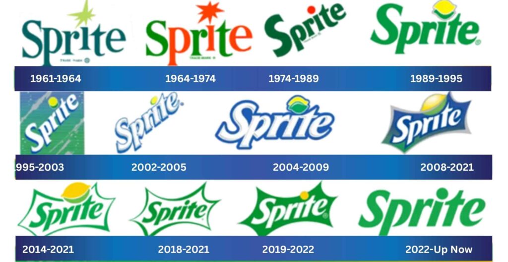
Sprite Logo Evolution
1961–1964: The Original Classic
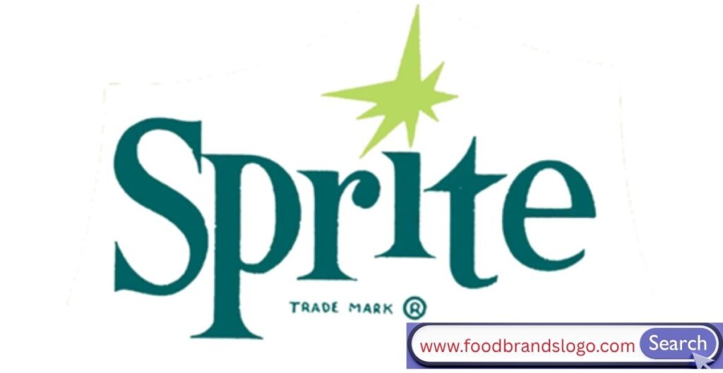
Shortly after Sprite’s official introduction in 1961, the original Sprite logo made its debut. In a humorous homage to its citrus character, it had a lemon dotting the “i” in a strong green wordmark with a simple, clean style. The mid-century branding era was reflected in the typography’s understated serif design.
1964–1974: Introduction of Bubbles
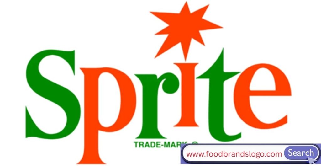
In order to emphasize effervescence, this version included dynamic bubbles and a splash surrounding the wordmark. The font changed to a more contemporary, geometric style. The citrus theme was maintained by the persistence of the lemon motif. Growing soft drink branding strategies that emphasized visual appeal and product freshness were in line with this age.
1974–1989: Bold & Youthful
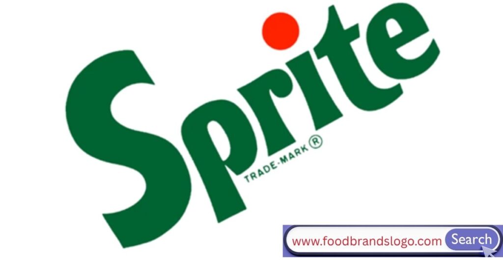
Sprite adopted a bold sans-serif font with a more pronounced color contrast in the middle of the 1970s. The “i” still had a lemon on it, but it had a more lively, abstract feel now. Television commercials and other promotional materials aimed mostly toward teenagers and young adults used this version.
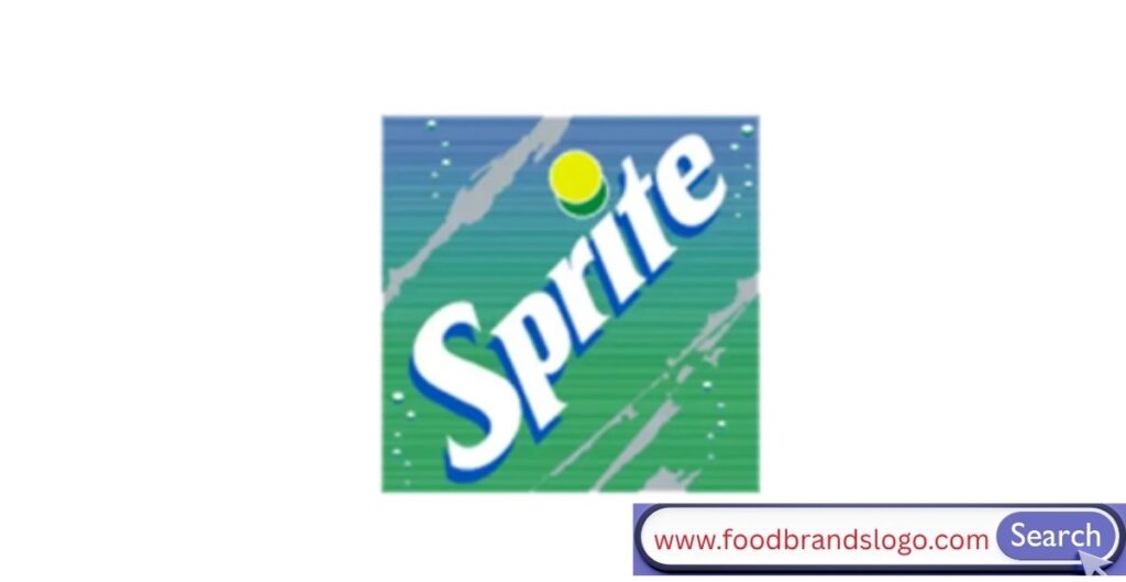
1989–1995: The Splash Era
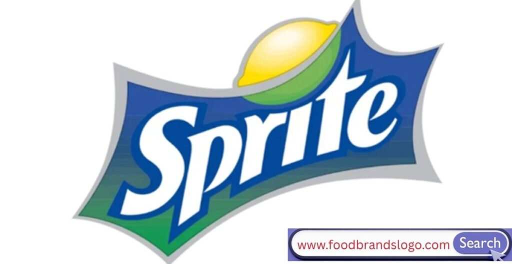
Sprite underwent a big redesign during this period, introducing the characteristic blue splash behind the wordmark along with brilliant green and yellow gradients.The goal of the logo was to convey the fizz and flavor explosion of the soda while also being visually striking. During the early conceptual stage of the “Obey Your Thirst” campaign, this version coincided with Sprite’s rapid expansion.
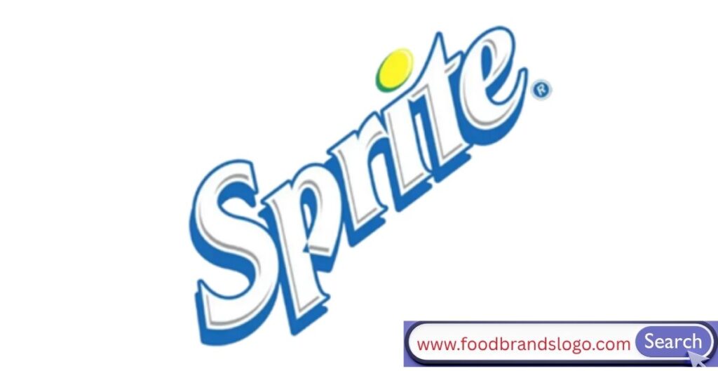
1995–2003: “Obey Your Thirst” Campaign Identity
Sprite retained a sharp, vivacious outline beneath the logo but eliminated the actual splash. Hip-hop, street style, and urban culture were prominent at this time. The logo complemented the rebellious, edgy tone, and the slogan “Obey Your Thirst” took center stage. The “i” now had a citrus dot that shone, almost like a ray of sunshine.
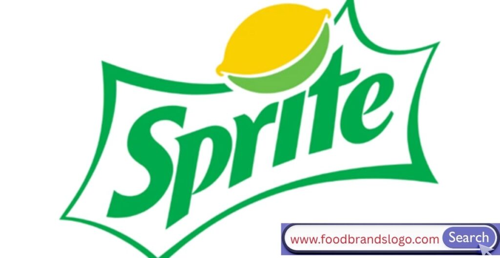
2002–2005: Sleek Modernism
Sprite unveiled a more streamlined wordmark and a sleeker logo with silver elements. The lemon component was subdued, but the green and yellow hues persisted. Presenting the Sprite brand as bold, sleek, and contemporary was the goal of this design.
2004–2009: Bubbles and Metallic Effects
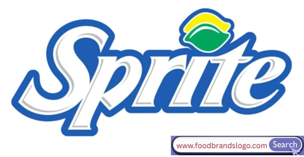
A blend of visual elements emerged—a glossy wordmark, metallic outlines, and splash effects—to reflect energy and coolness. The color palette was richer: deeper greens, blues, and glowing yellows. Sprite leaned into digital-friendly branding with this version, prepping for the online age.
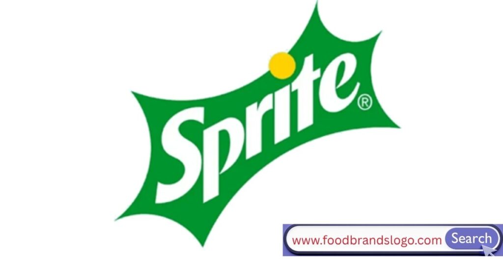
2008–2011: Simplified & Refined
Sprite tried with a simpler version, removing the splash effects and metallic glows. The logo shifted back to a simpler white font on a green backdrop, emphasizing uniformity and clarity throughout the packaging.
2014–2021: Minimal & Modern
The flat design trend was demonstrated in this version. The yellow and green were still there, but they seemed more delicate and sophisticated. To guarantee more pristine brand representation on digital platforms, Sprite invented transparent logo formats like SVG and PNG.
2018–2021: Tweaks and Digital Adaptation

The company refined its graphic assets for social media and high-resolution screens, notwithstanding their subtlety. Designers rebuilt the citrus sign and slightly altered the font weight for visual balance. This change enhanced the brand’s consistency online.
2019–2022: New Energy
The Sprite logo changed in 2019 to include larger lemon slices, a chunkier typography, and greens that contrasted sharply. With a louder volume and a focus on digital-first audiences, this version complemented youth-oriented marketing initiatives on mobile, YouTube, and TikTok.
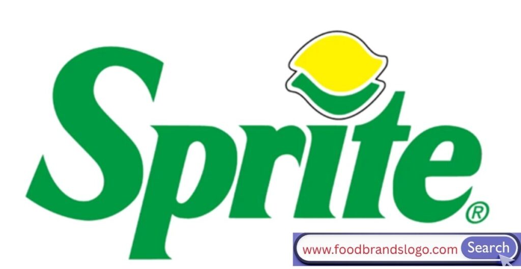
2022–Today: Flat, Fresh & Forward
The current logo is a simple, flat, and clean white wordmark on a green background with stylized citrus edges. It preserves Sprite’s history while reflecting contemporary minimalist branding ideals. Additionally, this design is fully scalable for print and digital media, and it optimizes the logo for multiple formats (SVG, PNG, and JPEG).
Logo Design Elements
Font
Sprite has employed a range of sans-serif typefaces over the years, all of which are thoughtfully crafted to suggest vitality and freshness. The current edition has a welcoming yet assertive tone thanks to the usage of a bespoke font that is bold but rounded.
Color
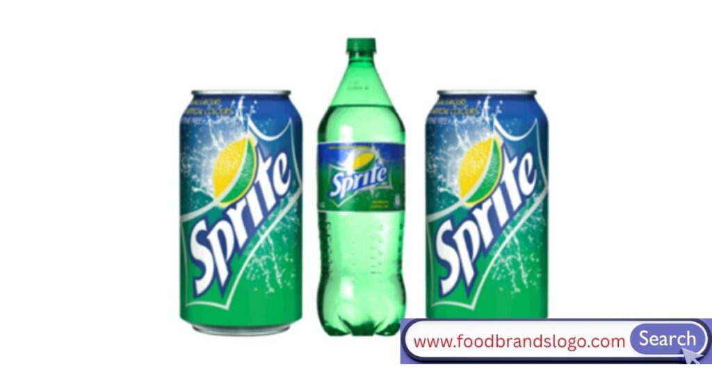
The Sprite logo is dominated by green, which stands for nature, health, and fresh lime. Accents of yellow, which resemble lemon zest, convey a sense of vitality and citrus vibrancy. The occasional usage of blue creates contrast and contributes to the crisp, chilly sensation of a carbonated beverage.
Formats
Adaptability is necessary for modern branding. Sprite’s logo is accessible in SVG, PNG, and JPEG, among other transparent forms. This guarantees uniformity in packaging, mobile apps, digital platforms, and even vending machines.
Hidden Message
Despite its subtlety, the lemon dot above the ‘i’ in various versions represents Sprite’s citrus ancestry. Certain designs also suggest a ‘splash’ or explosion beneath the wordmark to signify freshness and carbonation. These design choices create a subliminal connection to refreshment.
Slogan
Sprite’s most recognizable tagline is “Obey Your Thirst”. It helped solidify the brand’s reputation as audacious, rebellious, and associated with young culture when it was first introduced in the 1990s. The brand’s emphasis on individualism and self-expression is reflected in the motto.
Facts
- Sprite was introduced in West Germany in 1959 as “Fanta Klare Zitrone.”
- The Coca-Cola Company launched it in the U.S. in 1961.
- Sprite is available in over 190 countries worldwide.
- Sprite’s revenue generation exceeds $1 billion annually.
- Sprite is a major sponsor in global sports and hip-hop music events.
- The logo has been redesigned more than 10 times in its history.
- Sprite’s green bottle is as iconic as the logo itself, symbolizing freshness.
Conclusion
The Sprite logo is a dynamic representation of the essence of the company, not just a design. Sprite’s visual identity has changed with purpose, inventiveness, and cultural significance from its beginnings as a German soda to its current status as a worldwide icon of refreshment.
Every redesign narrates a story about how the Sprite brand engages with consumers through symbolism, emotion, and clarity, in addition to design trends. Every element has contributed to the development of Sprite’s history, from the splash of green to the classic “Obey Your Thirst” tagline.
Take a moment to admire the logo the next time you have a Sprite—it’s a sparkling piece of design history.
FAQs
1. When was the first Sprite logo introduced?
The first Sprite logo debuted in 1961 when the Coca-Cola Company launched the drink in the U.S.
2. What does the Sprite logo symbolize?
The logo symbolizes refreshment, citrus flavor, energy, and effervescence, often represented through color, font, and splash-like shapes.
3. Who owns the Sprite brand?
Sprite is owned by The Coca-Cola Company.
4. Has the Sprite logo changed over time?
Yes, the logo has gone through over 10 redesigns, each reflecting new trends and audience preferences.
5. What’s the meaning behind the lemon dot on the “i”?
It symbolizes the drink’s citrus roots—specifically lemon and lime—and adds a playful, fresh element to the design.
6. Why is the Sprite logo green?
Green represents lime freshness and is strongly associated with Sprite’s flavor, ingredients, and identity.
7. What was Sprite originally called?
It was originally called “Fanta Klare Zitrone” when it was first introduced in West Germany.
8. Is Sprite a global brand?
Yes, Sprite is sold in over 190 countries and is one of the top-selling soft drinks worldwide.